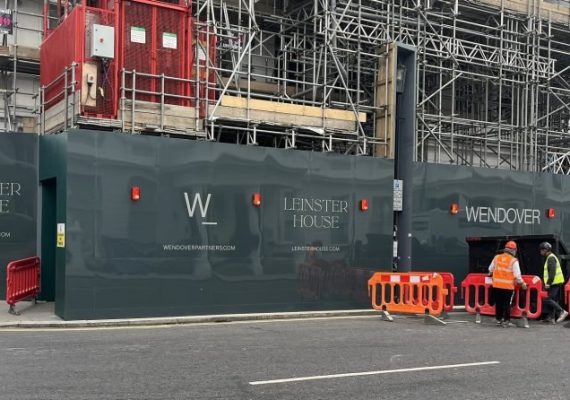
When it comes to hoarding design, typography plays a crucial role in attracting customers and conveying the message. However, it is not just about choosing the right font or pairing them correctly. Maintenance and durability are equally important aspects that should be considered while designing hoardings.
One of the first things to keep in mind is the material used for printing the typography on hoardings. It should be durable enough to withstand harsh weather conditions such as rain, wind, or sunlight. The material should also be resistant to fading and peeling off over time.
Another consideration is how easy it is to clean and maintain the typography on hoardings. Any dirt or grime accumulated on the surface can obscure its legibility and readability. Therefore, using materials that are easy to clean with mild soap solution or water can help ensure their longevity.
Moreover, if your hoarding design involves illuminated typography, make sure that all electrical connections are properly sealed against moisture intrusion. This will prevent any short circuits from happening during heavy rains or other adverse weather conditions.
Regular maintenance checks must be carried out by professionals periodically so that any wear and tear can be identified early on before significant damage occurs.
Considering maintenance and durability factors while creating printed hoarding designs ensures they remain effective throughout their lifespan despite being exposed to different environmental elements over time.
As the world of design continues to advance and evolve, so does the role of typography in printed hoardings. From understanding its anatomy and selecting the right font to mastering size scaling and colour contrast, typography is an essential aspect that can make or break a hoardings’ success. With a deep understanding of font psychology, legibility, readability, and brand identity incorporation, designers can create impactful Typography in Printed Hoarding that effectively communicate their messages.
However, it is important not just to focus on aesthetics but also consider maintenance and durability factors for long-lasting results. By avoiding common mistakes in hoarding typography such as overcrowding texts or using inappropriate fonts, designers can ensure their work stands out from the competition. As new designs emerge every day, professionals must stay up-to-date with trends while never losing sight of time-tested principles.
The ever-evolving role of typography in hoarding design highlights its importance in capturing attention and conveying messages effectively; by honing your typographic skills today you’ll be prepared for tomorrow’s challenges within this dynamic field!
Typography in Printed Hoarding can make a world of difference in hoarding design, elevating your brand and capturing the attention of your target audience. If you’re interested in creating impactful printed hoardings, the team at Project Print Management is here to help. Our expertise spans from design, typography, material selection to location optimisation. To explore more about our work or to start a conversation about your needs, we invite you to visit our blog page for insightful articles and resources, or reach out to us directly via our contact us page. We’re excited to hear from you and look forward to bringing your vision to life!