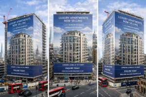
In today’s competitive property market, visibility is everything. Developers invest heavily in land, planning, and construction, yet one of the most valuable marketing opportunities is often overlooked: the site hoarding. A well-considered Creative hoarding design can transform a temporary construction barrier into a powerful branding and sales tool, working around the clock to communicate value, ambition, and quality.
For developers who want to stand out from the crowd, especially in busy urban or suburban locations, creative hoarding is no longer optional — it is essential.
The Role of Hoarding in Modern Property Development
Hoarding has traditionally been viewed as a practical necessity: a boundary to secure a site, protect the public, and meet health and safety requirements. While these functions remain critical, hoarding now plays a far more strategic role.
A thoughtfully designed hoarding can:
- Promote a development long before completion
- Attract interest from potential buyers or tenants
- Communicate what is being built clearly and confidently
- Improve perceptions of the construction site
- Demonstrate professionalism and attention to detail
In high-footfall areas or along busy roads, hoarding effectively becomes a free, large-format advertising space. The challenge is ensuring it actually captures attention.
Why Creative Hoarding Design Makes the Difference
Many developments still rely on generic hoarding solutions: muted colours, stock lifestyle imagery, and overcrowded layouts. While these may tick a box, they rarely make an impression.
Creative hoarding design focuses on originality, clarity, and impact. It asks a simple but crucial question: what will make someone notice this site as they pass by?
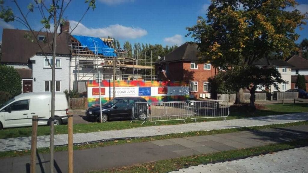
This was exactly the challenge faced by a small independent developer in Twickenham, where Project Print Management was asked to design and install a hoarding system that would do more than simply blend in.
The Twickenham Project: A Small Site with Big Visibility
This particular development site was located on a busy road in Twickenham, surrounded by rows of residential housing constructed largely from brick and white render. Thousands of people passed the site every day — commuters, parents, cyclists, and local residents.
For the developer, this presented a clear opportunity. Rather than using standard developer hoardings with predictable imagery, they wanted something bold, modern, and distinctive.
The brief was clear:
- Avoid generic “library” lifestyle photography
- Create something eye-catching and memorable
- Clearly communicate what was being built
- Keep the design clean, simple, and confident
In short, they wanted to stand out — without overcomplicating the message.
Colour as a Strategic Tool on Creative hoarding design
One of the most powerful elements of creative hoarding design is colour. In visually repetitive environments, colour immediately draws the eye.
In suburban settings, streets are often dominated by neutral tones: brick reds, greys, creams, and whites. Introducing strong, deliberate colour into this landscape creates instant contrast.
For this project, colour became the foundation of the design strategy. Rather than relying on imagery-heavy panels, the hoarding used bold colour blocks combined with clean typography and minimal graphics. This approach ensured:
- High visibility from a distance
- Easy readability for passing traffic
- Strong brand recognition
Colour was not used for decoration alone — it was used to communicate confidence and modernity.
Creative hoarding design Keeping the Message Simple (and Effective)
One of the most common mistakes in hoarding design is trying to say too much. Developers often have multiple stakeholders involved: the developer, main contractor, architect, estate agent, and funding partners — all wanting prominence.
The result can be cluttered hoardings where no single message stands out.
Creative hoarding design is about discipline. The goal is not to include everything, but to prioritise what matters most to the audience.
For the Twickenham site, we focused on:
- What is being built
- Why it is desirable
- Who to contact for more information
By stripping back unnecessary elements, the hoarding became easier to understand at a glance — which is exactly how most people experience it.
Material Choice: Quality Reflects Value
A creative design deserves to be produced on materials that enhance, rather than undermine, its impact.
For this project, the hoarding was produced using 3mm aluminium composite board, a premium material commonly used for high-quality external signage. The panels were digitally printed onto high-resolution self-adhesive vinyl and finished with an anti-graffiti laminate.
This approach delivered several benefits:
- Crisp, vibrant colour reproduction
- A smooth, professional finish
- Improved durability on a live construction site
- Protection from minor damage and vandalism
The anti-graffiti laminate not only protects the print but also adds a subtle gloss finish, giving the hoarding a polished, high-end appearance that reinforces the developer’s brand positioning.
Practical Design Decisions That Save Cost
Creative hoarding design is not just about aesthetics — it’s also about making smart, practical decisions.
Because this was a relatively small hoarding installation, we deliberately avoided adding header boards and kickers. While these elements can be useful on larger or uneven sites, in this case they would have:
- Increased cost unnecessarily
- Interrupted the clean visual lines
- Distracted from the core design
By working with the existing hoarding structure and allowing the artwork to stand alone, we achieved a stronger visual result while keeping the project cost-effective.
Standing Out Without Shouting on Creative hoarding design
One of the key successes of this project was balance. The hoarding stood out clearly from its surroundings, but it did not feel aggressive or out of place.
Creative hoarding design is not about shouting louder than everyone else — it’s about communicating more clearly.
By using confident colour, restrained typography, and a focused message, the hoarding achieved high impact without visual noise. It caught attention, sparked curiosity, and reinforced the quality of the development behind it.
The Broader Value of Creative Hoarding Design
While this project was for a small developer, the principles apply to developments of any scale.
A strong hoarding design can:
- Generate early interest and enquiries
- Improve perceptions of a development before completion
- Support sales and marketing strategies
- Reflect positively on the developer and contractor
- Reduce the negative visual impact of construction
In an increasingly image-conscious world, how a site looks during construction can influence how the finished development is perceived.
Why Project Print Management for Creative hoarding design?
At Project Print Management, we understand that hoarding is not just a barrier — it’s a communication platform.
Our approach combines:
- Creative design thinking
- Technical print expertise
- High-quality materials
- Practical installation knowledge
We work closely with developers, designers, and contractors to ensure each hoarding solution is visually strong, durable, and commercially effective.
Whether you need a bold creative statement or a clean, informative presentation, we tailor each project to suit the site, the audience, and the budget.
Looking to Elevate Your Creative hoarding design?
If you’re planning a development and want to make the most of your hoarding space, creative design can deliver real value from day one.
Contact Project Print Management to discuss how a Creative hoarding design can help your project stand out, attract attention, and present your development with confidence — even before the first brick is laid.
For more information on Printed hoardings or Creative hoarding design speak to the specialist Justin Murray at Project Print Management.
For our latest print projects visit our blog page
Keyword: Creative hoarding design, Printed Building site hoarding,