Colours speak a language that words cannot replace. They affect emotions and emotions influence the results. Most of the disagreements are caused by different perceptions of the people that results in the creation of different realities.
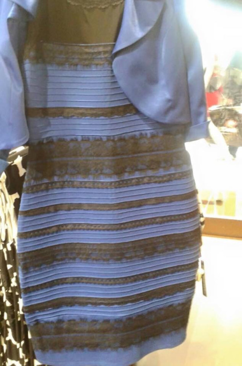
In 2015, the photograph of a dress on the internet became viral and people disagreed on the colour of the dress. Some said it is black and royal blue. While others argued that it is white and gold. This disagreement between thousands of people around the globe revealed a very interesting fact that there is a difference between colour perceptions. It led towards a new research subject for scientific purposes. Apart from the fact that human beings have different colour perceptions, colour also influences the decisions of the people in certain circumstances.

In the past few decades, some incidents happened which will surprise you that how colours can influence human activities and their decisions.
How colour influences our decision making
In 2000, the authorities in Glasgow changed the colour of streetlights from yellow to blue for the improvement of city appearance. There was a surprising result that it decreased the number of street crimes in the area.
Likewise, in 2005 Railway authorities in japan decided to install blue lights on train platforms in Nara city. This attempt reduced the number of suicides, reports after the installation showed that there was a zero percent suicide attempt on the train platforms using the blue lights. As a result of this shocking result, blue lights are installed on railway platforms across the country.
These incidents show that colours have an irresistible effect on human beings. They can influence our perceptions and decisions that is why choosing the right ones for your advertisements and marketing can have a greater impact on your sales.
There is science behind the research.
Many pieces of research have been done in the past to check the relationship between the colours and buyers’ behaviours. It was noticed that red and royal blue connect the impulse buyers. Bargain lovers are mostly affected by navy blue and teal. Traditionally based shoppers are mostly connected with the soft colours. Likewise, brown could not be a good option for product packaging as it gives an image of rotten vegetables and fruits.
Colours are divided into 2 major groups warm and cold. Red, yellow, orange, and their combinations are included in warm colours while blue, purple, green and their combinations are named as cold colours. Black, white, and greys are called neutral ones.
Let us have a look that how colours affect our daily life. Their selection is very important while designing a space. Warm colours help in perceiving a warm environment and as a result, people become more social. That is the reason behind using warm colours in living rooms and dining rooms. Cold colours are used in the bedrooms. In films, colour schemes set the tone of the scene as warm colours are used for a joyous scene while cold colours are used for a sad scene. Purple is used to portray creativity and fantasy.
The right colours can make a difference
Here is another interesting fact that in cold cities usage of warm colours at the entrance of the store can bring more customers. Next time when you go out shopping keep an eye on the fact that you decided the store because of your own choice, or it is due to the first look at the shop entrance.
Stores use a neutral colour scheme and place their products on a high contrast colour shelf to draw the attention of the customers. In films, colour schemes set the tone of the scene as warm colours are used for a joyous scene while cold colours are used for a sad scene. Purple colour is used to portraying creativity and fantasy.
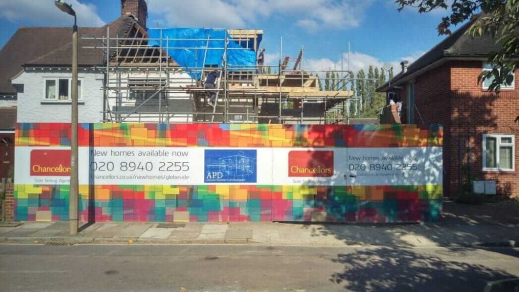
Do you want an increase in your clientele? Then choose the right printed hoarding for your business.
Remember that the human brain recognizes traits about different products and their brands. So, whenever a consumer sees a colourful hoarding the colour psychology is at work. Colours are the key to bridge the gap between your products and your targeted audience. Selection of the ideal colour scheme for your product marketing is a tricky part but we are here to assist so that you can communicate with your targeted audience in the most effective way.
Colours speak the language which is persuasive more than words but Knowing about the colour importance in marketing is not enough as the main challenge is to harness the colour psychology to understand what your buyer needs.
Colourful hoarding is a persuasive form of advertising
PPM is a digital print business in the United Kingdom. We are a company with 25 years’ experience in the print industry. Our services include colourful hoarding, building wraps, printed hoardings, window graphics, outdoor media, and much more.
Whether you need a construction site colourful hoarding or window graphics for the marketing of your product, we have the experience to do the job perfectly.
We specialize in large print projects. Ranging from printed protection screens in glass lifts 30 meters high to vinyl wrapping market stall doors for council, we have pushed the boundaries of print installation by generating the most unusual print work. When other printing companies claim that it is impossible, we make the impossible, possible by accepting the challenges.
We pay attention to the fact that which colours meet the needs and expectations of your targeted audience within your industry. We understand that using a colour palette that does not meet your potential buyer’s expectations can destroy the sales of a certain product before reaching the market, so we use colours according to your industry. Project Print Management provides a practical and safest solution by offering practical advice, design, and installation.
For more information on colourful hoarding please visit here. For our latest print projects please visit our blog.


